News
NTGAS: How to Redesign an Industrial Brand Without Losing Its Essence
- 02/07/2026
- What I like
Some brands come into your life as a professional assignment and end up becoming part of your own story. NTGAS is one of them. An industrial, family-owned, international brand linked to the manufacture of professional equipment for the hospitality industry, but also a company for which I have a very special affection because, over the years, it has become much more than a client.
At ElefantAmbulant, I often talk about brand creation, corporate identity, strategy, logos, typography, and how a good brand can help a company communicate better what it is. But in the case of NTGAS, the work had a different nuance: it was not about creating from scratch, but about redesigning an existing brand without betraying its essence.
And that, although it may seem simpler, is often much more complex.
A company that was 300 meters away and I didn’t know it
Before working with David and Héctor Pardo, I already knew Héctor personally. But, curiously enough, the company was practically unknown to me. And I say curiously because NTGAS’ former location, in El Real de Gandia, was barely 300 meters from my home.
Yes, 300 meters.
Sometimes we have huge projects very close by and we don’t see them until life decides to put them in front of us. That happened in 2013, when I met David and we started working on a new website for the company.
That first contact was enough to sense two things. The first was that I was facing a company with enormous potential, with its own product, technical knowledge, industrial capacity, and a very powerful family story. The second was that the graphic brand was going to be a problem.
Not because it lacked personality. It had plenty. But it did not meet many of the parameters a well-structured and well-conceived brand must fulfill: legibility, balance, versatility, adaptability, formal coherence, and ease of application across different media.
And when we are talking about an industrial company, this becomes even more important.
The problem of a brand that was difficult to apply
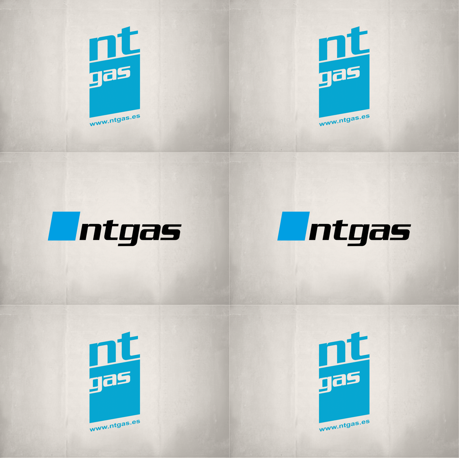
The old NTGAS brand had a vertical layout, with a striking but complicated composition. It worked in some contexts, but it was difficult to adapt to the company’s day-to-day reality.
An industrial brand does not live only on a business card or a website. It lives on product plates, machines, catalogs, international trade fairs, vinyls, packaging, technical instructions, commercial documentation, vehicles, presentations, corporate videos, and so much more.
And that is where the old brand began to suffer.
Its vertical construction made it difficult to apply to many products manufactured by NTGAS. Reading it was not always comfortable, the whole composition had too much visual tension, and integrating it into horizontal spaces was complex. In short, the brand was not helping the company enough to project the image of solidity, precision, and innovation it truly had.
So I suggested to David and Héctor that I present them with a redesign.
And they said yes.
When redesigning does not mean erasing
When I began the process, my first impulse was to work on a completely new brand. As often happens when facing a redesign, you start searching for paths, solutions, compositions, typefaces, symbols… But there was something that just didn’t fit.
The new proposal could be more modern, yes. It could also be cleaner. But I felt it moved too far away from the essence of NTGAS. And that was a mistake.
David and Héctor were happy with their brand. They felt it was theirs. It was part of the company, its history, its journey. And in branding there is something we should never forget: a brand does not belong to the designer; it belongs to the company, its team, its clients, and the memory it has built over time.
You do not always have to break things. You do not always have to invent a disruptive idea. Sometimes you have all the elements of a winning brand right in front of you, and all you need is to look at them differently.
And then Ferran Adrià came to mind.
Deconstruction as a branding method
Ferran Adrià revolutionized avant-garde cuisine by deconstructing traditional dishes. He did not destroy the recipe: he analyzed it, dismantled it, respected its essence, and presented it again in a new, more precise, more surprising, and more contemporary way.
And I thought: that is the way.
The solution to redesigning the NTGAS brand was not to eliminate what came before, but to deconstruct it. To understand which elements had value, which ones were part of the company’s visual memory, and which ones needed a new structure to work better.
So I recovered the typography. Serpentine, with its technical, industrial, and slightly futuristic character, had a lot of strength. It was part of NTGAS’ visual DNA. The problem was not the typeface, but how it was organized.
The next step was to place all the letters of NTGAS on the same level. That apparently simple decision completely changed the perception of the brand. It turned it into a more solid, more horizontal, more stable brand, and one that was much easier to apply.
Suddenly, NTGAS breathed differently.
The symbol: a graphic ally for everything
Another of the great successes was recovering and enhancing the symbol. That blue, slanted, forceful geometric element became much more than a companion to the logotype. Over time, it has been one of my greatest graphic allies in developing the entire visual universe of the brand.
Its shape conveys movement, technology, direction, and energy. It is a simple element, but one with great personality. It can work as a compositional resource, as a container, as a visual accent, as a pattern, as a signage element, or as a support for different messages.
In a company like NTGAS, where communication has to move between the technical and the commercial, between the industrial and the emotional, having such a versatile graphic resource is gold.
That symbol has made it possible to build coherent applications in catalogs, stands, videos, presentations, social media, corporate documentation, and promotional pieces. It has helped give visual unity to a company that has never stopped growing, innovating, and diversifying its communication.
A cleaner, stronger, and more recognizable industrial brand
One of the great achievements of this redesign was getting NTGAS to move from having a clearly outdated brand, conditioned by a complex composition that was difficult to apply, to having a much more timeless identity, capable of perfectly withstanding the passage of time. And this is important, because redesigning does not mean changing for the sake of change. As my admired Pepe Crespo used to say when talking about the evolution of a brand: “If it works, why would you change it?”. That phrase sums up the spirit of this project very well. It was not about erasing NTGAS’ visual memory, but about detecting what worked, preserving it, organizing it, and giving it new life. The new brand did not break with the previous one: it made it grow, cleaned it up, balanced it, and prepared it to coexist with a more modern, more international, and more ambitious company. That is precisely the difference between a graphic occurrence and real corporate identity work.
Thus, the result of the redesign was a clearer, more balanced, and more professional brand. A corporate identity capable of respecting NTGAS’ past while preparing it for the future.
The new logotype gained in legibility. The horizontal composition made it easier to apply to machinery, the website, catalogs, and commercial materials. The typography maintained the brand’s technical character. The blue color reinforced the idea of technology, precision, and trust. And the symbol provided a highly useful visual system for building the brand beyond the logotype itself.
Because a good identity is not limited to “placing the logo.” A good identity gives you tools. It allows you to organize communication, create recognizable pieces, and make every support breathe the same personality.
And for NTGAS, that was essential.
A brand for a family company with international projection
Over the years, NTGAS has shown that the brand needed to match the level of a company that works internationally, manufactures its own products, and continues to evolve with new lines, new solutions, and new brands.
The identity had to convey industry, but also closeness. Technology, but also craft. Innovation, but also family. Because NTGAS is not just a factory of professional equipment for the hospitality industry. It is a company with history, with people, with clients who trust it, and with a very specific way of doing things.
A large part of the brand’s value lies in that balance.
A well-crafted industrial brand should not feel cold. It must be precise, yes. It must be solid. But it must also reveal that behind it there is judgment, experience, and a way of understanding the business.
Trust, honesty, and many years of work
I am convinced that that redesign was one of the starting points of the trust David and Héctor placed in me. Not because the brand turned out well—which it did too—but because the process was honest.
I did not try to impose someone else’s idea. I did not try to show off with a proposal that broke with everything. I tried to listen, understand, respect, and improve. And that, for me, is one of the keys to good branding.
Since then, I have been fortunate enough to develop many other brands and projects for NTGAS, eventually taking on the direction of its Marketing and Communication department. A responsibility I take on with pride, because this company is part of my professional and also emotional day-to-day life.
I close this text with a very special thank you to my great friends David Pardo, CEO of NTGAS, and Héctor Pardo, CFO, for all these years working side by side.
Thank you for trusting my experience from the very first moment. Thank you for allowing me to become part of the NTGAS family. Thank you for letting me contribute vision, strategy, and communication to a company that keeps growing, innovating, and taking its brand further and further.
And above all, thank you for continuing to enjoy every project together.
Because in the end, creating a brand is also about this: building trust, sharing the journey, and helping a company tell better who it is, where it comes from, and where it wants to go.
Tito Estruch
Interim Manager in Communication | Expert in Marketing and Brand Creation