
News
AirsFon: A New Brand to Hear Life with Clarity, Heart, and Hope
- 08/01/2026
- What I like
We’ve said it before, and we’ll say it again: talking about ElefantAmbulant means talking about brands that are born from real needs—but also from strategic thinking, bold vision, and a deep sense of purpose. And few stories reflect this better than the creation of AirsFon, a brand under the ANGELS vision Group, created to carve out a new path in the competitive world of hearing aids.
Yes, hearing aids. But not just any kind. These are accessible, modern hearing aids, with a clear identity and a message that rings loud and clear: everyone deserves to hear well. Because hearing is living. It's connecting. It's being present.
When the Market Speaks, You Have to Listen
In the world of hearing solutions, the big names dominate: Phonak, Oticon, Widex, Interton, Phillips… Strong, well-established brands, but often distant from a very important segment of the market—those who need effective hearing assistance but can’t, or don’t want to, pay premium prices.
That’s where Arturo Torró’s vision came in. Anyone who knew him knows he wasn’t one to let opportunities slip by. His business instinct led him to spot a clear gap between the big brands and the everyday user. A gap that could be filled with a homegrown brand, well-built, strategically designed, and carrying a clear, honest value proposition.
And that’s how AirsFon was born.
A second brand in the group, complementing ANGELS fon, with a stronger focus on audiology services and retail, but with a different mission: to democratize hearing—without sacrificing professionalism, design, or human connection. A brand built to speak eye-to-eye with its users, no fancy bells and whistles needed.
A Visual Identity That Beats with the Heart of Sound
When I was asked to develop the brand identity for AirsFon, I knew it had to be a brand that moved people and communicated honestly. One that inspired confidence but also optimism. One that spoke of technology, yes—but never forgot the people it serves.
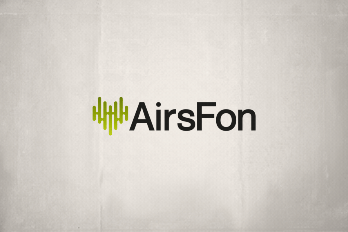
That’s why we began with the symbol: a heart made of sound waves. Not a flat, decorative heart—but a beating, vibrant one, pulsing with life and meaning. A symbol that says what matters most: behind every hearing aid is a story, a family, a reunion, a rediscovered way of hearing what was once lost.
The heart represents humanity, the waves represent technology. And it’s in that fusion that AirsFon comes alive—a brand that connects emotion with hearing.
Green as a Symbol of Hope for Those Who Want to Hear Again
The choice of the primary color was equally deliberate. In a market flooded with clinical blues and tech grays, we chose to stand out with a vibrant green, full of life.
Why green? Because green represents hope, health, nature, and renewal. And that’s exactly what AirsFon offers to those with hearing loss (the hard of hearing, or hearing-impaired): a new opportunity to reconnect with the world.
This green runs through the brand like a lifeline—from the symbol to every graphic application—creating a visual identity that is fresh, bright, and unmistakably unique.
Built to Compete, Designed to Connect
AirsFon is not a decorative brand. It’s a brand built to compete head-on. And to do that, it needs far more than a pretty logo. It needs a coherent, professional, scalable, and well-structured identity.
From day one, we worked with a growth mindset: designing for retail spaces, signage, packaging, digital platforms. The visual system had to adapt seamlessly to both physical and digital environments, always preserving the brand’s essence.
The name—short and easy to pronounce in any language—supports memorability and versatility. The design applications, tailored for both clinical and consumer-facing environments, are based on clean visual codes, strong contrasts, and accessible messaging, delivering professionalism without coming across as cold or distant.
Accessible Branding for an Accessible Brand
One of the biggest challenges—and greatest joys—of projects like AirsFon is creating a brand that has real impact without a massive budget. A brand that’s clear at first glance, and that works across all formats: from storefront signage to a mobile app or loyalty card.
That’s why we designed with a modular, practical mindset, allowing the heart symbol and the green color to work effortlessly across signage, social media, acquisition campaigns, or product catalogs.
The tone of the brand is approachable, human, and empathetic. It doesn’t try to dazzle with technical jargon, but instead brings technology closer to those who truly need it. And in the hearing aid industry, that’s not just important—it’s essential.
Listening to Create: The Value of Understanding Those Who Can’t Hear
If this project has taught me anything, it’s that to build a great brand, you first need to listen. And in this case, listening meant understanding the experience of the hearing-impaired.
Because they’re not just looking for a product. They’re looking for empathy, for tailored solutions, for support. And that only happens when a brand goes beyond aesthetics and truly connects with their reality.
AirsFon is made for them. For those who want to recover conversations, laughter, meaningful silences. For those who want to hear their grandchildren’s voices again, the sound of the sea, the music they love.
Thank You for Trusting Me to Give Shape to This New Heartbeat
I want to end this article with a very special thank you to Arturo Torró, for once again placing his trust in my work, for allowing me to build a new brand from scratch, and for giving me the freedom to bring both vision and structure to the table.
And thank you for allowing me to design a symbol with true meaning: a heart made of sound waves, to remind us that behind every sound, every frequency, every conversation regained, there’s a story worth telling.
AirsFon is not just a brand. It’s a statement. It’s the pulse of a new way to hear the world.
And for me, it’s been an honor to be part of its birth.
Tito Estruch
Interim Manager in Communication | Expert in Marketing and Brand Creation