News
MLN6: How We Created a Young, Honest Brand with a Clear Direction to Transform the Transport Sector
- 07/08/2025
- What I like
Talking about ElefantAmbulant means talking about how brands are built from their very essence. Sometimes, projects come from an emotional place—through trust and personal connection. That was the case with MLN6, a brand born from a group of young entrepreneurs determined to improve the day-to-day lives of independent truck drivers and small transport companies across the country.
My relationship with the MLN6 partners goes back a long way. They already knew me from my time working on communications for Llácer y Navarro, one of the major transport companies in Spain. That experience allowed me to understand in depth the complexities of the road transport sector. So when they shared their idea with me, I immediately knew they didn’t just need a logo—they needed a brand with a clear, honest identity that could truly connect with the industry.
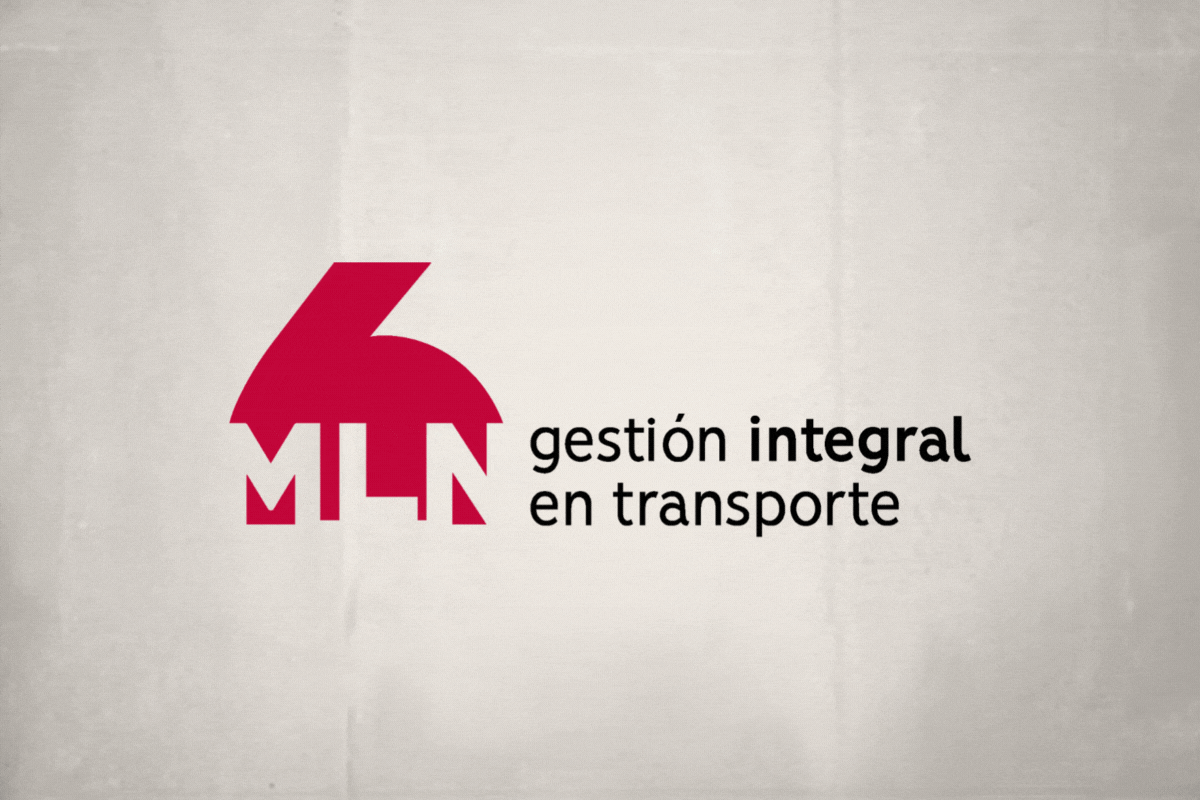
A name that sounds like a generation: MLN6
The naming came from a cultural and generational reflection. At that time, the term “millennial” was everywhere. And these founders not only belonged to that generation, but also strongly identified with it. From that reflection came the acronym MLN, and the number 6 was the finishing touch, adding graphic strength and a unique sound.
That’s how MLN6 was born: a young, direct, and easy-to-remember brand with strong phonetics, a visually attractive identity, and high digital availability. From the start, we made sure the name was free of legal conflicts and secured the relevant domain names and social media handles—an essential step in today’s digital landscape.
The importance of choosing the right name
Choosing the right name for a business is one of the most delicate and strategic steps in building a brand. It’s not just about creativity or aesthetics: a good name must be memorable, easy to pronounce, aligned with the company’s philosophy, and legally available. It’s critical to ensure that the name can be trademarked, that the web domain is available, and that the handles are free on social media to ensure a unified and professional digital identity.
A good name is much more than a label—it’s the first impression a client gets of your project. And MLN6 checked all the boxes to become a strong, functional, and future-ready brand.
The brand: structure, dynamism, and simplicity
From day one, we aimed for a versatile brand that could adapt to all the uses a young, digital-native company would need: website, social media, roadside signage, vehicle graphics, mobile apps...
To achieve this, we designed a visual system based on a modular structure. The brand has a solid yet flexible construction: the logotype can be used in a single line, stacked, or even as a vertical icon. This allows it to adapt to any platform without losing recognition or legibility.
Typography and color: technology and closeness
The MLN6 logo uses a geometric, clean, sans-serif typeface, conveying modernity and tech-savviness. It’s a brand that doesn’t need embellishments—its power lies in its simplicity.
For the color palette, we opted for a burgundy red as the primary color. While it’s not part of the traditional color scheme in the transport sector, it brings a fresh, updated approach. This isn’t a flat red—it includes variations and nuances that allow it to adapt to multiple applications while maintaining visual consistency. Burgundy red conveys strength, elegance, and commitment—essential values for a company aiming to provide documentation management, services, and advisory with a personal, professional touch that inspires trust through experience.
Real-world applications: when a brand hits the road
A good brand doesn’t live on paper—it moves. And in the case of MLN6, quite literally, as a big part of its visibility came from vehicle graphics and its presence in key spaces for everyday truckers.
That’s why from the very beginning, we worked on mockups for vans, signage, business cards, and digital platforms. The result was a brand that not only worked on screen but also came across as solid, professional, and full of character in the physical world.
The branded signage for MLN6’s facilities was one of the project’s highlights. Thanks to clean layouts, high contrast, and the visual impact of burgundy against white or asphalt, the designs stood out and became mobile communication tools.
A brand with purpose, clarity, and service in its DNA
MLN6 didn’t want to look like a big consultancy. It wasn’t about selling fluff. Its mission was clear: make paperwork easier, reduce stress, and offer real solutions to transport professionals who often face a mountain of bureaucracy on their own.
That’s why the brand needed to be approachable, clear, and accessible. And it was—right from the start. No gimmicks. No ego. Just an identity that breathes trust, youth, and in-depth industry knowledge.
A special project, with meaning
This was a special project. Because of the close relationship with its founders. Because of the conviction behind its launch. And because of the trust they placed in me from the very beginning. Thank you to the entire MLN6 team for letting me be part of the launch of something so honest and necessary.
At ElefantAmbulant, I’ll continue to share stories like this—stories where communication and design come together to build real, useful, and soulful brands. Because a great brand doesn’t just represent a company: it gives it a voice, presence, and above all, meaning.
See you in the next post.
Tito Estruch
Interim Manager in Communication | Expert in Marketing and Brand Creation