
News
ROBINALIA, the Brand that Cultivates Values: Fair Trade, Sustainability, and Design with Heart
- 01/07/2025
- What I like
When a branding professional is tasked with developing the identity of a brand like ROBINALIA, they know it’s not just a design exercise—it’s a declaration of intent. Because ROBINALIA is not just a commercial project; it’s a daily manifesto that another way of consuming is possible, that fair trade is not a utopia, and that values can be the engine of a profitable, sustainable, and deeply human business.
Authentic brands reflect the soul of those who create them, and ROBINALIA is a perfect example. This fair trade company doesn’t just sell local fruit and vegetables—it conveys the values, honesty, and commitment of its founder, Javi. When a brand is born from the heart, it shows in every detail: in its design, in its message, and in the way it connects with people. ROBINALIA is not just a sustainable company—it’s a reflection of a way of being, of doing things with meaning and purpose.
In this post on ElefantAmbulant, I want to share the process behind the creation of ROBINALIA’s visual identity—a fair trade project that works directly with farmers in the Valencian Community, especially in the La Safor region, to deliver freshly harvested fruit and vegetables straight from the field to consumers' doors. A project that champions a fair relationship between producers and consumers, cuts out unnecessary intermediaries, promotes responsible consumption, and does so with transparency and closeness.
Designing a brand for a project like this starts with listening—truly listening—to understand what moves the people behind it, and translating that into a visual language that breathes those values. That’s exactly what we did with ROBINALIA.
Robinalia: Justice for the invisible heroes of the Valencian fields
In a world where large supermarket chains impose unfair prices and European regulations seem to turn a blind eye to imports from third countries, Robinalia emerges as a brave, ethical, and necessary response. Inspired by the spirit of Robin Hood, this brand doesn’t steal—but it does fight to reclaim the real value of the work done by those who deserve it most: small-scale farmers.
Robinalia is not just a fair trade company; it’s a frontline defense for the dignity of the Valencian countryside. That same land that has fed generations, and now suffers from a system that rewards volume and punishes quality. Lifelong local farmers are paid prices below their production costs, while supermarket shelves are filled with oranges from South Africa that have traveled farther than their flavor can reach.
This is where Robinalia steps in as an act of justice. Because when you buy a box of oranges through their platform, you’re not just buying fruit—you’re supporting a more human, local, and transparent model. You’re saying yes to freshly harvested produce, to fair prices, and to respect for honest labor.
Even the name of the brand is a statement: Robinalia is a place where the interests of the small and vulnerable matter. Where farmers are protagonists, not victims. Where consumers regain control over what they eat, knowing exactly who benefits from their purchase.
This isn’t about charity—it’s about justice, real sustainability, and an economy with soul. Robinalia doesn’t just deliver fruit—it delivers awareness, flavor, and dignity in every box.
A brand that’s a gift for everyone
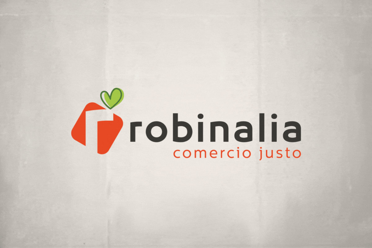
From the very first sketch, we knew ROBINALIA needed a strong, recognizable, and meaningful symbol. We wanted to represent the act of giving and receiving—fairly and honestly. That’s why the brand icon is a package, a gift. But not just any gift: a box wrapped with a ribbon that’s actually a heart.
That green heart, crowning the package, is the clearest symbol of ROBINALIA’s commitment to sustainability, to the environment, and to the love for those who work the land. Because buying from ROBINALIA means more than just getting fruit—it means receiving the effort of a farming family, respect for the natural cycle, and the freshness of something made with care.
Colors that taste like truth
Color plays a central role in ROBINALIA’s visual identity. The dominant reddish-orange evokes oranges, Mediterranean sunlight, and vitality. It’s a color that transmits energy and warmth, evoking nature, everyday life, and sensory richness. The green of the heart balances the whole: it stands for hope, sustainability, and awareness.
The use of dark gray in the primary “robinalia” wordmark adds contrast, readability, and solidity. It conveys professionalism without losing warmth. And the reddish-orange used in the “comercio justo” tagline connects directly with the brand’s mission, reinforcing its core message.
A typeface without frills, full of character
The chosen typeface for ROBINALIA blends modernity with simplicity. It’s a sans serif with friendly geometry, rounded shapes that are easy to read and radiate approachability. It’s an honest typeface—just like the project it represents. It doesn’t try to impress—it simply says: “We’re here, we’re accessible, transparent, and real.”
A website that breathes commitment
ROBINALIA’s digital ecosystem couldn’t be just another online store. That’s why we designed a website that is simultaneously a showcase, a tool, and a manifesto. It’s a place where users can not only buy fresh produce but also learn where it comes from, who grows it, and how much each stakeholder earns.
One of the key elements is the public price breakdown: how much goes to the farmer, how much to logistics, and how much to management. Very few brands dare to do this—but for ROBINALIA, it was essential. Because if the goal is to change the way we consume, it must start with being exemplary.
Values you can taste
Sustainability, environmental respect, fair trade, transparency, quality, and closeness—these aren’t just words at ROBINALIA. They’re principles present in every decision, from choosing farmers to designing the packaging. And it shows.
When working on the visual identity of this brand, I knew we had something special in our hands. This time, it wasn’t about creating an image that sells more—but one that tells better. And that is always the most ambitious (and rewarding) goal we can aspire to in branding.
ROBINALIA, ultimately, is a brand that puts people at the center—those who grow and those who consume. A brand that understands that design can be the bridge between them. And proof that when values are clear, identity almost creates itself.
Tito Estruch
Interim Manager in Communication | Expert in Marketing and Brand Creation