
News
Qair Sustainable Engineering: Brand Design with a Breath of the Future
- 12/05/2025
- What I like
In the world of branding, design, and visual identity, there’s something that goes far beyond the creative exercise: pedagogy. I’m not talking about justifying a design, but about guiding, explaining, and helping the client understand that a brand doesn’t begin with a color or end with a pretty typeface. It begins with the essence, the purpose, the soul of the project. And if all of that is clearly defined, then—and only then—can a visual identity become a brand.
That’s why, when a client returns, when they trust you with a new project, the satisfaction is double. Because they not only valued your previous work, but also your way of thinking, of listening, of building. That was exactly the feeling when I received the commission to create the brand for Qair Sustainable Engineering, a company dedicated to sustainable engineering, specialized in the design and implementation of energy efficiency solutions for homes and businesses.
Sustainability as a Starting Point
Aerothermal energy, geothermal systems, photovoltaic energy, self-consumption, efficiency, and savings. These are concepts that today feel familiar to us, but just a few years ago seemed exclusive to technical forums or environmentalist circles. The world has changed—so has our relationship with natural resources and the environment. In this new paradigm, companies like Qair offer not just technology, but responsible solutions.
From the start, the client wanted a brand that spoke of all this: of the future, of quality, of commitment to the planet—but without falling into clichés. The brief came with a specific challenge: the letter “Q” for “Quality” needed to be present, but not obvious. At the same time, it needed to symbolize the balance between technology and nature, between precision and respect.
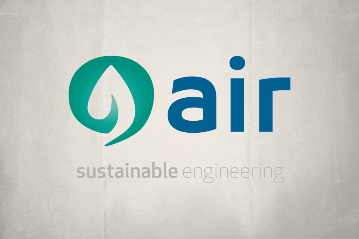
The Symbol: A “Q” That Breathes Nature
The logo begins with an open, flexible, adaptive “Q.” Within its inner eye, there’s a stylized leaf, a universal symbol of nature, life, and sustainability. No cables, no gears, no harsh shapes—only fluidity, organic lines, breath. As if the “Q” were inhaling clean air.
That was one of the key ideas: connecting the brand with the belief that well-applied technology doesn’t pollute—it oxygenates. Qair doesn’t just install energy-efficient systems—it enhances the quality of life.
Next to the symbol appears the word “air” in lowercase. This is no accident. Lowercase letters convey approachability, modernity, and accessibility. They avoid the shout, the corporate ego, and instead promote a tone that is kinder, more contemporary, more honest. The contrast between the symbol and the typography creates a highly effective visual balance.
The selected typeface is geometric, with rounded edges that relate to the technical world, but also to the human one. It is clean, readable, and unpretentious—because sustainability is also found in simplicity.
Colors: Harmonious, Natural, and Sustainable
Creating a brand is not about painting a logo—it’s about designing a system of identity. And like any well-constructed system, it begins with the basics. Black and white are not a lack of color; they are the beginning of everything.
As designers, it is our responsibility to explain, guide, and educate throughout the process. Only then will the client understand that every stroke, every shape, and every absence of color has a reason.
And once they do, the brand isn’t just seen—it’s felt.
In the color version, beyond the mandatory black and white applications (which, let’s remember, must always exist), we chose a palette that reinforces the message:
-
Aquamarine green: symbolizes nature, water, clean air, and renewal. It’s a calm yet bold color that communicates sustainability without falling into the expected.
-
Steel blue: conveys technology, precision, and professionalism. It’s not a cold or distant blue—it’s a trustworthy, balanced tone that inspires confidence.
Visually, both colors interact beautifully. They contrast without clashing. They reflect the balance between the natural world and the technical world.
Color is not chosen based on taste, but on conceptual and emotional coherence. It’s analyzed for what it conveys, how it behaves on different backgrounds, its role in brand architecture, and the values it activates.
In this way, corporate colors go beyond “looking nice” and become strategic tools. They connect with the audience, reinforce brand attributes, and create differentiation in the market.
“sustainable engineering”: Hierarchy That Informs and Elevates
Beneath the main name is the descriptor “sustainable engineering.” And here too, there was intentional design work. The word “sustainable” appears in a medium gray, darker and heavier. While “engineering” is rendered in a lighter, thinner gray. This choice adds visual dynamism and style, while also emphasizing the company’s sustainable focus.
At a single glance, the viewer understands that sustainability is the key differentiator, and engineering is the means to achieve it.
A Brand with Fresh Air
Creating this identity was, in many ways, an exercise in coherence. Coherence with the historical moment, with social responsibility, with respect for the planet. But it was also an opportunity to create beauty through functionality, to prove that sustainable brands can also be desirable.
Qair is not just a brand. It is a statement of intent. A way of looking to the future without forgetting the present. Of putting technology at the service of well-being. Of breathing better.
Tito Estruch
Interim Manager in Communication | Expert in Marketing and Brand Creation