
News
TORA KAI Shotokan Karate Do: A Brand Forged in Passion and Discipline
- 23/04/2025
- What I like
Everyone who knows me knows how easy it is for me to get involved when something excites me, and how rarely I say no to collaborating with people I care about or share passions with. In this case, both things came together: affection and passion. I am deeply proud to have been part of the founding group of the TORA KAI Shotokan Karate Do Club, and to have been able to contribute with what I do best: giving visual form to a concept, an identity, a philosophy.
A Brand Born on the Tatami
I had been practicing karate for several years with my sensei, Joan Vidal, a true reference in the martial art and an example of perseverance, humility, and technique. However, I had never thought about what image a club would have if we ever decided to found one. And yet, due to professional bias, my brain rarely rests: where others see a name, I see a logo; where there’s a color, I connect it to an emotion; and where there’s structure, I’m already thinking about visual hierarchies.
That’s why, when we officially founded the club, the first thing I did was apply the method: briefing, analysis, research, conceptualization.
TORA KAI: A Society with Claws
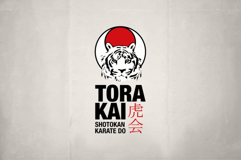
The name came to life organically. It was the name agreed upon by the founding members, and the more we said it, the more power it had. “Tora Kai” can be translated from Japanese as “society of the tiger” or “group of the tiger”. “Tora” (虎) means tiger, and “Kai” (会) means group or association. We had a solid foundation for building a unique and coherent identity.
For the visual elements, I started with two premises: I wanted something instantly recognizable, but also rich in symbolism. The solution was clear: the red rising sun (hinomaru), central element of the Japanese flag, on a white background. In front of it, the head of a Bengal tiger—powerful, direct, and bold.
In Japanese culture, the tiger represents strength, courage, elegance, and longevity. It is said to protect against illness, evil spirits, and bad luck. In the context of karate, the tiger also symbolizes mastery over body and mind. It is not a reckless beast but an animal that acts with determination, technique, and wisdom.
Typography and Kanji
The logo is completed with a bold sans serif typeface, modern and balanced, conveying authority without losing harmony. The club name appears in black, and to its right, in red, the Japanese kanji for TORA KAI (虎会), adding authenticity and aesthetics.
I wanted the logo to reproduce perfectly on any medium: uniforms, patches, posters, social media, or official documents. And to have enough strength to be memorable effortlessly.
Shotokan and Karate Do: More Than Just Words
The reference to our style was a must: Shotokan. This style of karate, founded by Gichin Funakoshi, is one of the most practiced worldwide. It is known for its precise techniques, deep stances, and its emphasis on discipline and personal growth. “Shoto” was Funakoshi’s pen name and means “pine waves,” while “kan” means “hall” or “house.” Thus, Shotokan translates to “Shoto’s house.”
Meanwhile, “Karate Do” means “the way of the empty hand.” More than a combat technique, Karate Do is a life philosophy. It is the constant pursuit of improvement, respect, and inner growth. The “Do” (道) represents a never-ending path—a lifelong search for balance between body, mind, and spirit.
Colors That Speak Tradition
The color scheme was no accident. Red, white, and black are deeply rooted in Japanese culture and the world of karate. Red represents passion, life force, and fighting spirit. White symbolizes purity, beginnings, and humility. And black, of course, is the result of the journey: maturity, mastery, and the responsibility that knowledge brings.
This color trio also works beautifully in visual terms. It allows for clear contrasts, perfect legibility, and great versatility across applications.
A Brand You Wear and Feel
One of the biggest challenges (and one of the greatest rewards) was seeing how the brand worked in the dojo gear. The logo embroidered on gis, printed on T-shirts, backpacks… not only served its identifying function but also created a sense of pride. It became a unifying element—a banner.
And for someone who believes that brands must be felt, not just seen, that’s the ultimate goal.
A Legacy Beyond the Tatami
Due to personal and professional circumstances, I had to leave the club and also the practice of this martial art that has given me so much. But what fills me with joy is knowing that the members of TORA KAI continue to respect, care for, and use this brand as if it were part of their own inner dojo.
Every time I see it on social media, in a tournament, or in a group photo, I feel like a piece of me is still there. That tiger’s face is still roaring—strong, watchful, serene.
Because in the end, a brand is not just lines and colors. It is a story, an attitude, a way of understanding what we do and how we share it with the world.
And that, without a doubt, was the philosophy behind the creation of TORA KAI Shotokan Karate Do.
Tito Estruch
Interim Manager in Communication | Expert in Marketing and Brand Creation