PARÍS hnos. Catering: The Flavor of a Family Brand with a Lot of Heart
- 15/04/2025
- What I like

Some projects arrive quietly but bring a smile with them. When the París family reached out to me to create the identity for their new venture, I knew I wasn’t just designing a brand—I was becoming part of a story that has been written for decades with flour, ovens, and care.
A New Branch of a Family of Bakers
The París family has run the most well-known bakery in the small Valencian town of Piles for many years. Those who know them understand that their reputation is no coincidence: they work with excellence, honesty, and flavor. And in the world of food, that is priceless.
From their bakery have come countless sweets, breads, and savory delights that have graced the tables of generations. So when they decided to expand into event catering, I knew this new project had to be a natural extension of what they already were: closeness, quality, and trust.
The Naming: As Personal As It Gets
There was little doubt about the name. “París” already meant something in Piles and its surroundings. It was recognizable, evocative, and opened the door to an imagery that could work in favor of the brand. The decision was easy: PARÍS hnos. Catering. Direct, family-based, and with heritage.
Design with the Flavor of a Big City and the Heart of a Small Town
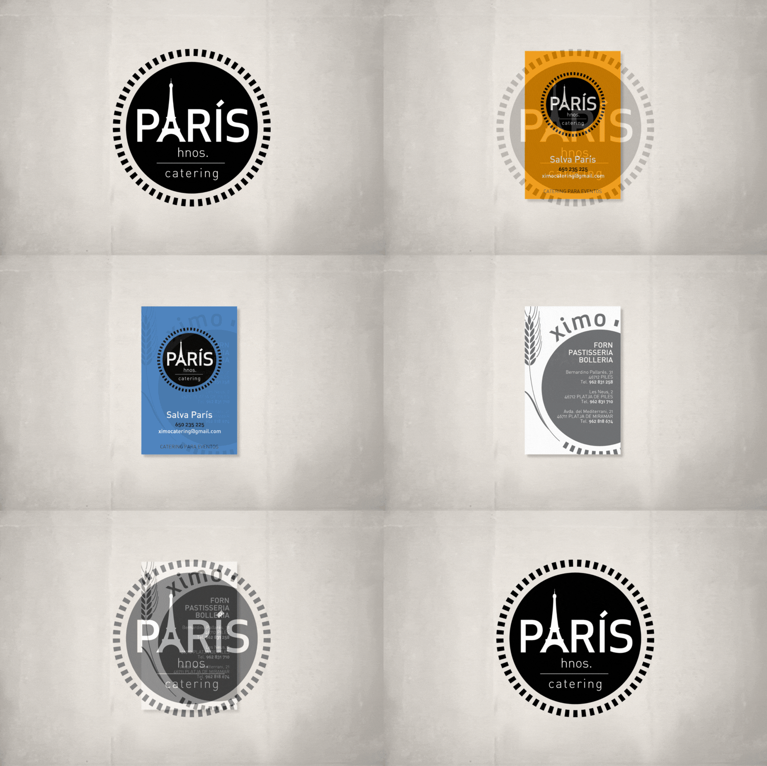
The most interesting part came with the brand’s visual development. We had a strong name, and with it, the opportunity to play with the mental associations that “París” brings to mind. That’s where the Eiffel Tower entered the scene, taking the spotlight in the logo by elegantly and symbolically replacing the letter “A.”
This decision not only gave the logo personality but also added a very fitting touch of sophistication for a catering service. Because, while the soul of PARÍS hnos. is humble and hardworking, the presentation of their products is always meticulous and tasteful. The Eiffel Tower in the logo is an aspirational nod that feels completely natural.
The Doily: A Frame That Tells Stories
The name is encircled by a dotted circular line, reminiscent of the paper doilies used to line trays of pastries, empanadas, or canapés at celebrations. It’s a detail that stirs emotion because it rescues a classic visual from the catering world and turns it into a defining graphic feature.
This frame not only beautifies the logo but also connects with the senses: looking at it, you can almost imagine the flavors, the aromas, the festive atmosphere. And that is precisely what a good brand should do—evoke, without needing to explain.
Color and Vitality in Every Version
For the stationery and business cards, we chose a bold and joyful color palette. Four dominant colors:
-
Orange-yellow: associated with energy, optimism, and freshly baked bread.
-
Lime green: freshness, novelty, vitality.
-
Sea blue: trust, professionalism, calm.
-
Red: passion, intensity, celebration.
These colors not only fulfill an aesthetic role but also help to trigger distinct emotional associations depending on the event type. This way, the brand becomes versatile and adaptable, while remaining consistent.
A Reverse Side That Connects Past and Future
The back of the cards connects the new catering service to its roots—the bakery. It was designed in grey tones, with a sober yet effective composition. And, as a visual thread, the circular doily appears again.
It lists the three locations of the París family bakery in Piles, Playa de Piles, and Playa de Miramar. This clearly communicates to customers that the catering service is not a passing idea, but an extension of a well-established craft.
A Simple Brand, Full of Nuance
PARÍS hnos. Catering is a brand that doesn’t need to shout. Its strength lies in authenticity and approachability. It’s a brand that speaks of family, of tradition—but also of celebration, care, and shared joy.
For me, it was a joy to participate in this small yet meaningful project. Because when you’re entrusted with a brand through trust, the result always comes from the heart. And working with people who dedicate their lives to sweetening others’ lives is a gift for any creative.
Thank you for allowing me to name and shape a new chapter of your story. And thank you for reminding me that the most beautiful brands are sometimes baked slowly, with care, and full of flavor.
Tito Estruch
Interim Manager in Communication | Expert in Marketing and Brand Creation
