
News
Color, Honesty, and Craftsmanship Turned into a Brand: ManoloLópez PINTURA & DECORACIÓN
- 18/03/2025
- What I like
The identity of a company can be an extension of the personality of the person behind it. In this case, I want to tell the story of ManoloLópez PINTURA & DECORACIÓN, a brand that was born without pretensions, without embellishments, with the intention of showing exactly what it is: a painting and decoration business with craftsmanship, dedication, and soul.
A Gift with Its Own Identity
When my friend Manolo told me he wanted to give his father a brand as a gift, the first thing I thought was: I’m not surprised. Manolo is someone who values design, takes care of his image, and surrounds himself with iconic 20th-century furniture pieces. It made perfect sense that he would want the same for his father’s business.
We met to discuss the project, as expected, over a good coffee. The premise was clear and direct: You know my father, he is what he is. And while this might sound like little information to some, for me, it was everything.
Manolo López Senior is a kind, friendly person, someone who is always a pleasure to talk to because he always has a smile on his face. And as a professional, he is a true master. But he is very clear about one thing: I am a house painter, plain and simple.
That was the starting point. The brand had to reflect his essence, without embellishments or false promises. Pure authenticity.
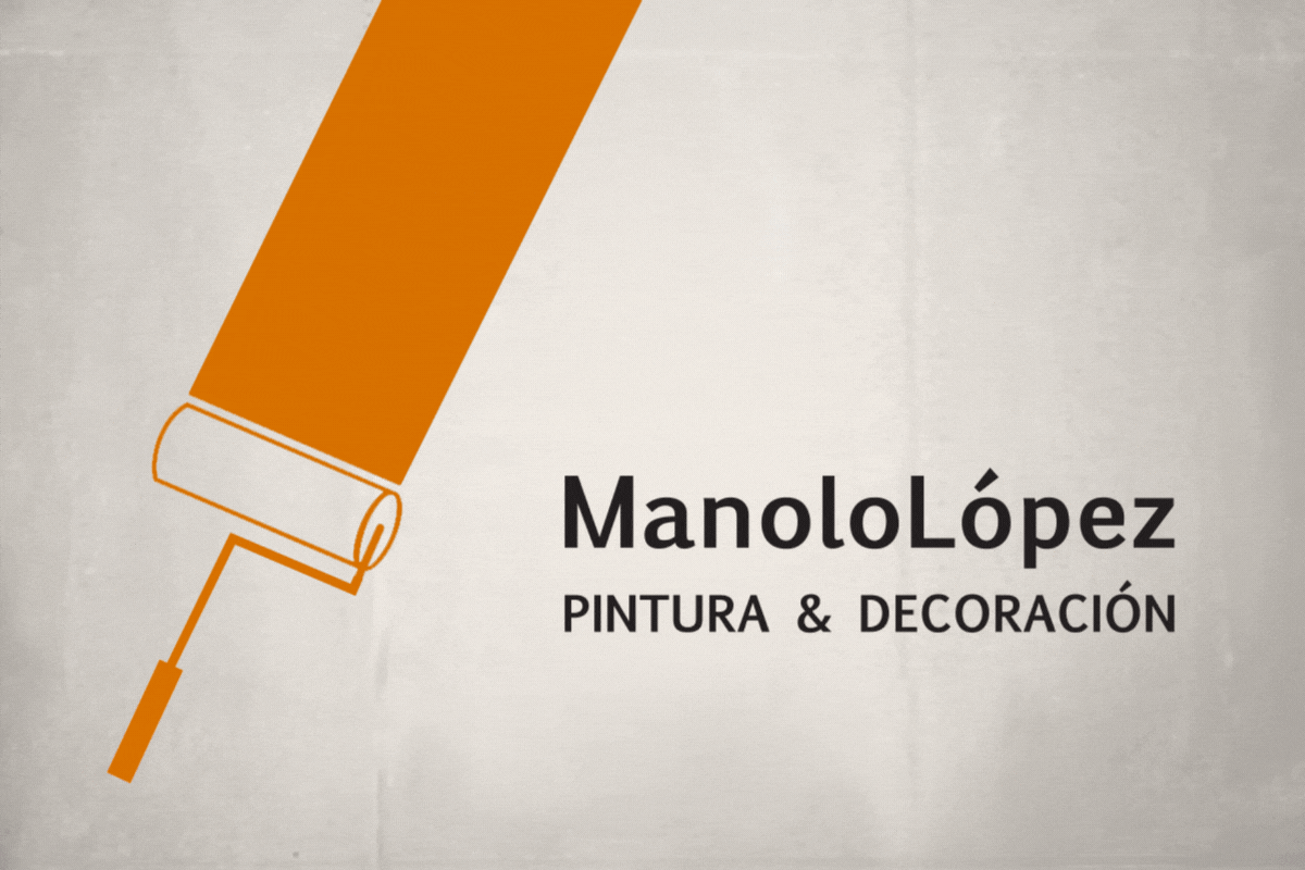
The Symbol: A Paint Roller That Brings Color to Our Lives
When conceptualizing the brand, I realized that Manolo Senior is not just a painter but someone who brings color, transforms spaces, and, in a very literal sense, improves people’s lives through his work.
So, the symbol had to be a paint roller. Simple, direct, without complications. A strong, recognizable, and versatile icon.
The roller also allowed for a wide range of colors, showcasing the versatility of his work. It wasn’t about a single color or style but an explosion of possibilities. That’s why the business cards weren’t all the same but played with different tones, almost like a collection of trading cards. Each card, printed on 450-gram matte laminated paper, featured a different color, reflecting the diversity and creativity of his trade.
It was a fun and effective way to communicate the essence of ManoloLópez PINTURA & DECORACIÓN.
Naming: Simplicity as a Strength
The brand name had to follow the same philosophy: no embellishments, no frills. ManoloLópez is written as one word, without spaces, because the brand is a unit, an identity that reflects a legacy, a name with weight.
On the other hand, PINTURA & DECORACIÓN was written in uppercase letters because we wanted it to be immediately clear what the business was about. Clarity and honesty were essential in this project, and there was no reason to hide anything. PINTURA & DECORACIÓN, no euphemisms, no detours, because that’s what he does, and he does it well.
The Choice of Colors: Tradition and Elegance
The brand’s colors had to evoke tradition, elegance, and warmth, characteristics that represent Manolo Senior and his craft.
- Ochre: A color that recalls craftsmanship, earth, and the history of painting. It also conveys warmth and closeness.
- Burgundy: A shade that evokes sophistication and experience, perfect for a company with years of expertise.
- Purple: A color that brings a distinctive, modern, and eye-catching touch, while still maintaining elegance.
This color palette created a balance between tradition and modernity, between the craftsmanship of manual labor and the refined image we wanted to project.
A Brand That Adapts to Any Medium
One of the most important aspects of a well-designed visual identity is its versatility. A good brand doesn’t just work on paper; it adapts creatively and impactfully to any medium.
In this case, one of the first requests after designing the identity was the customization of Manolo Senior’s van. Here, the paint roller once again played a leading role. Instead of simply placing the logo on the door, we designed graphics where it looked like the roller was painting the van itself, leaving a vibrant streak of color behind.
The result was spectacular. Not only did it work as a visual identity, but it also turned the van into a rolling marketing tool, grabbing attention wherever it went.
This is the magic of a well-thought-out identity: when designed properly, it can expand creatively onto any medium, from business cards to vehicles, uniforms, and promotional materials.
When Authenticity Creates Lasting Brands
When I presented the brand, both Manolos were delighted. And so was I. Because beyond the design, naming, or color choices, the most important part of this project was ensuring that the brand authentically reflected the person behind it.
Creating a brand isn’t about inventing something artificial. It’s about discovering what’s already there and giving it a visual form. And in this case, ManoloLópez PINTURA & DECORACIÓN was exactly that: a business without pretension, without deception, but with craftsmanship, quality, and its own identity.
I am incredibly grateful to Manolo for trusting me with this project and allowing me to be a part of something so special. Because when branding is done with truth and authenticity, the result isn’t just good—it stands the test of time.
See you in the next post on ElefantAmbulant, where I’ll continue sharing stories of brands born from the heart and built with strategy and passion.
Tito Estruch
Interim Manager in Communication | Expert in Marketing and Brand Creation